10 U-Shaped Kitchen Styles to Embrace
Check out this selection of clever cook spaces for all the inspiration you need to create a functional and fabulous room
U-shaped kitchens have a lot going for them – they can give you extra storage and work surfaces, and can even act as a divider between the kitchen and the rest of your room. They’re also ideal for creating the classic ‘triangle’ formation of sink, oven and fridge, which will help you use your culinary area more efficiently. Here are 10 U-shaped designs that work hard and look great.
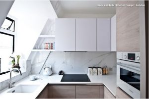
1. Tuck it in the eaves
In this studio apartment, a corner below the sloping roof is the perfect spot for a U-shaped kitchen. It’s a small area, but the efficient triangle layout (the built-in fridge is across from the sink) makes it a practical cook space. And by installing an eye-level integrated oven in a tall unit, the owners have created more storage.
The white wall units recede into the background rather than impose on the room, and the marble splashbacks reflect light to create the illusion of space.
Contemporary Kitchen by Born & Bred Studio
2. Skip wall units
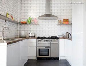
Like the previous kitchen, this one is part of a studio too. Here, the owners have decided against wall units and have gone for a run of shelving instead to enhance the sense of space. The white units may be pared-back and minimal, but the subway tiles with black grouting give the room instant character.
New ways to use beloved subway tiles
Contemporary Kitchen by deVOL Kitchens
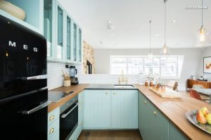
3. Let the oven take centre stage
If you’ve got an oven that you love, show it off by placing it in the middle run of your U-shaped kitchen. Here, the cream range cooker is the first thing you see as you enter the room and is a lovely feature in the space.
To bump up the storage in this narrow room, the left-hand run of the U-shaped layout has cabinetry that goes from floor to ceiling.
Country Kitchen by Domus Nova

4. Divide and conquer
This open-plan room consists of a kitchen, dining area and living space. The tiled half-height stud wall not only provides a splashback for the sink, but also creates a visual divide between the cooking and living areas. The row of units to the right of the sink doubles up as a breakfast bar and defines the dining area. Overall, the U-shape works well here as the kitchen is zoned off and cosy.
Contemporary Kitchen by Scenario Architecture
5. Blend in
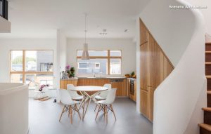
Want to maximise the sense of space in an open-plan room? Keep the kitchen area discreet. Here, the U-shaped kitchen was positioned in a corner spot and, by choosing joinery in the same wood, the entire space looks cohesive.
Even the choice of table is smart – the owners picked a round design that doesn’t jut out into the area beside it, and the colour prevents it from overwhelming the space too.
Dining tables: Which shape is best?
Transitional Kitchen by Hammonds Furniture
6. Go dark and dramatic
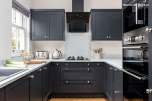
The classic layout of this U-shaped kitchen is traditional and functional. To give the room some drama, the owners went for charcoal grey units. It has instantly elevated the design and contrasts beautifully with the white benchtops and walls.
Transitional Kitchen by Not Just Kitchen Ideas
7. Embrace curves
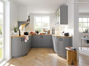
In this U-shaped kitchen, the owners have chosen to finish the left- and right-hand run of units with curved cabinetry. The rounded designs give a twist to the usual layout, and curved corners are more ergonomic than straight ones. This option is also a good idea if you’re worried about your kitchen protruding into the space around it, and in this room it works well with the herringbone floor.
Country Kitchen by B&Q
8. Mix things up
Rather than have base units on all three sides, try them on just two. Here, the owners have chosen to forego them at the rear. Instead, they’ve installed a shelf and wall units to create the U-shape. The design makes the room interesting and adds a feeling of space.
Browse more U-shaped kitchens
Scandinavian Kitchen by Kobod Ltd

9. Keep the window open
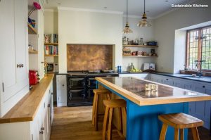
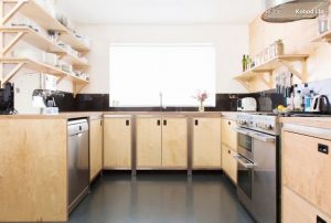
If one of the walls where you are positioning your U-shaped kitchen has a window, it makes sense to put the sink there. Not only do you want a good view when you’re doing the washing-up, but you also don’t want to disturb the view or light with wall units nearby. Here, the owners have chosen open shelves rather than wall cabinets on the other walls to add to the feeling of light.
Rustic Kitchen by Sustainable Kitchens
10. Max out with an island
If you’re lucky enough to have a large space for your U-shaped kitchen, why not add an island to increase storage and sitting and work areas? This room is big enough to fit an ample island with stools on two sides. And the owners have made a feature of it by painting it in a bright blue, which contrasts with the surrounding pale units.
When you’re choosing the size of your island, consider the distance between the island and other base units. If the island has cupboards in it, leave 120 centimetres space. If it has drawers, you’ll need just 100 centimetres.
Please note, goFlatpacks does not own the copyright to any of these images, we are just happy to spread the great variety of creativity we see within these cabinet designs. https://www.houzz.com.au/ideabooks/86609962/list/10-u-shaped-kitchen-styles-to-embrace


