
Creating Your Complementary Colour Scheme
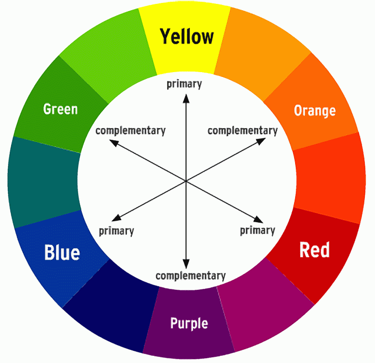
A complementary colour scheme is made up of shades, tints and tones of two colours which sit directly opposite each other on the colour wheel and, you guessed it, complement each other. These two colour ways are then often balanced with a mix of neutral colours like black and white. The two colours can be used sparingly through the room, however it’s always a good idea to choose one colour as the primary and its complimentary colour as the accent – a purple couch seated next to a yellow lamp or an orange linen set with blue scatter cushions. The purple and orange are the primary colours and the yellow and blue are the secondary.
Some easily recognisable complementary colour schemes are red and green – the iconic colours of Christmas, blue and orange – often used for beach houses and purple and yellow – usually representing royalty. This symbolic colour combinations can be applied to interiors in many different ways. The key to creating a complementary colour scheme that works is to incorporate different shades of each of the two colours. This creates depth and brings the colour scheme to life. If you are using just one shade of red and one shade of green, the room can appear quite flat and one dimensional.
Tips for designing a complementary colour scheme
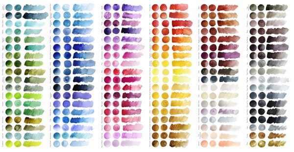
- Invest in a colour wheel (they only cost a few dollars) and play around with what colours you like. The colour wheel is an easy tool that shows you what colours will complement the colour you’re thinking of using.
- Don’t be afraid to play with colour! Step outside from the main colours like blue, yellow, red, orange, purple and green and use the mix of these colours. Instead of using bold red and heavy green, use soft pink which is complimented by yellow-green and will create a much softer palette.
- Pick your main colour and use its complementary colour as an accent to achieve a room that is harmonious and balanced. For instance, you could paint a feature wall in sky blue and hang soft orange curtains over the window.
- Like every colour scheme, light will have an effect on the colours in the room. Artificial and natural light will be absorbed and reflected off different colours in different ways depending on the tone of the colour.
- Always balance the colour scheme with neutrals. Black, grey, white, brown and beige can be easily mixed, matched and intertwined into a complementary colour scheme to ground the colours and pull the palette together.
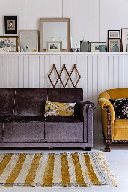
Subtle violet as the primary colour is complemented with the above pictures. Beautiful finishes with soft yet fresh baby pinks, greens and yellow for a light and airy space in. The use of light timber tones, crisp whites and a hint of black pull these schemes together.

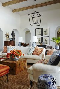
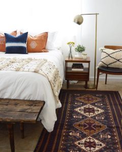
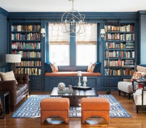
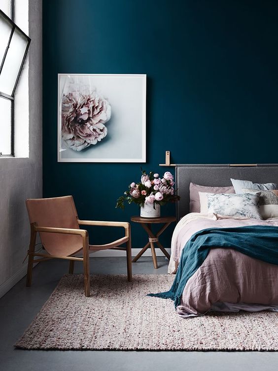
This first room has an almost even balance of bold orange and blue, however with the whole wall covered in a detailed orange print, it’s safe to say that would be the primary colour. With lots of white injected into this space, the strong tones of blue and orange are still visually appealing. Where are the next 2 photos demonstrate the use of these colours more sparingly also making it visually appealing. The last image is using a bold version these colours in a larger room making the blue the primary colour and the orange really pop!
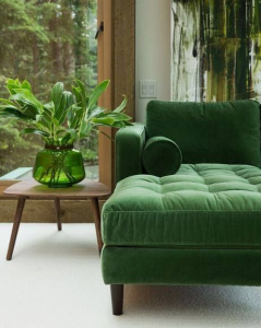
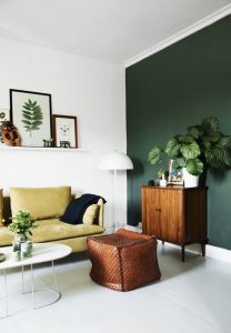
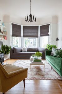
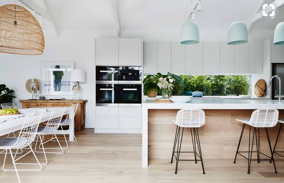
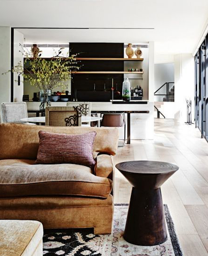
Greens with natural wood, charcoal & white are very popular at the moment. Whether its the use of one green lounge, a featured wall colour or the use of beautiful fresh greenery.
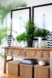
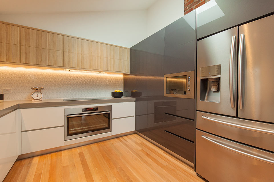
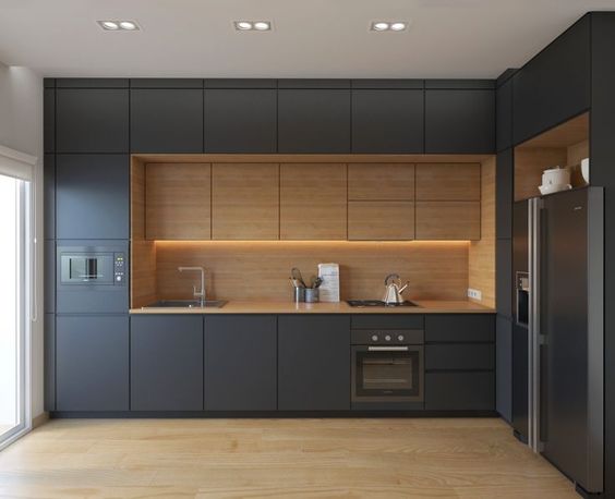
In 2017 we will be seeing more natural tones such as olive, terracotta, cinnamon and indigo which are a few big ones to look out for. Accents of copper and silver will also continue to be big with more natural tones such as charcoal, whites and timber which create a rustic yet controlled feel to a space.
We hope this has given you some inspiration in your next project. Order your free colour samples online to get started!
Please note, goFlatpacks does not own the copyright to any of these images, we are just happy to spread the great variety of creativity we see within these cabinet designs.


